
Print Stylesheets for a Personal Website — Making Pages Useful on Paper
Print Stylesheets for a Personal Website — Making Pages Useful on Paper
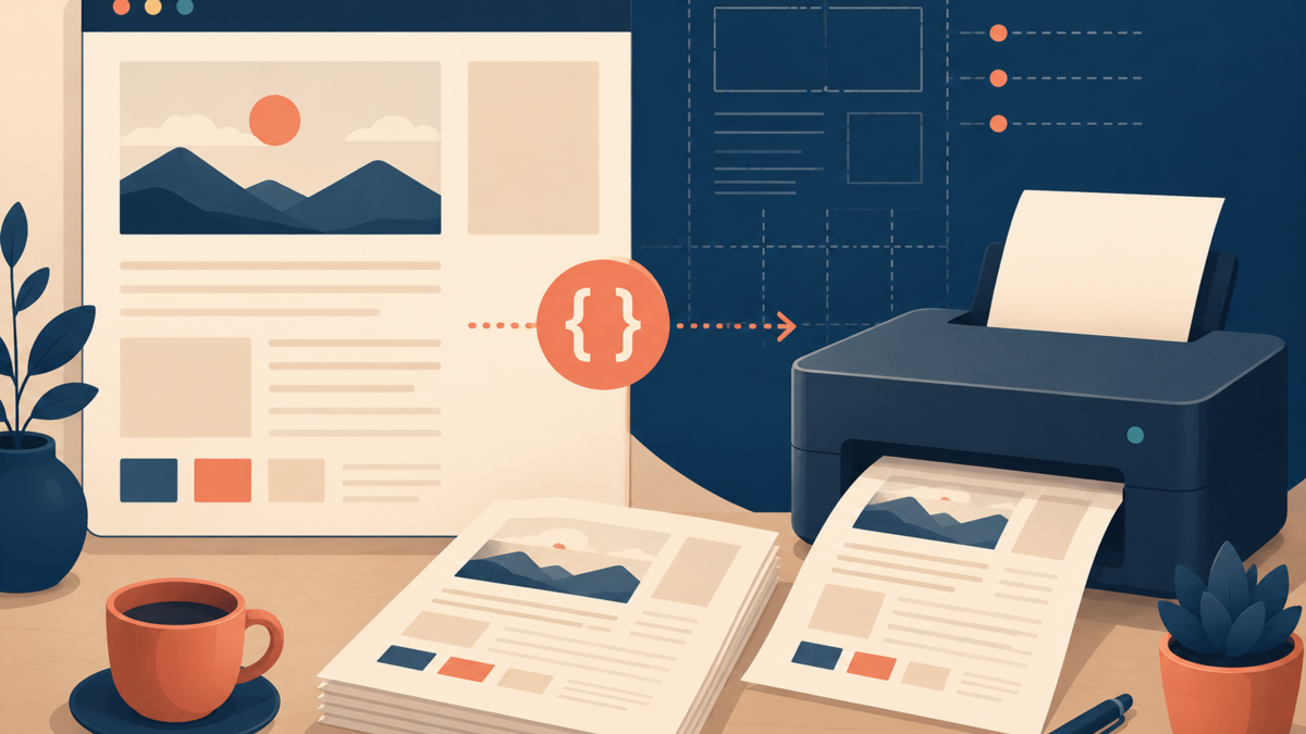
A while ago, I printed one of my own articles and discovered that the paper version included almost everything except a pleasant reading experience. The navigation occupied the top, the share buttons floated beside the text, dark colors consumed ink, and the final page contained little more than a footer.
Printing may sound old-fashioned, but people still save recipes, workshop instructions, invoices, study notes, and long essays as paper or PDF. A small print stylesheet respects that behavior. It is like tidying a room before a guest arrives: the content does not change, but unnecessary objects stop getting in the way.
Print Is Another Responsive Context
We usually describe responsive design as adapting a page to phones, tablets, and desktops. Paper is another viewport, only with unusual rules. It has a fixed physical size, hard page boundaries, no scrolling, no animation, and no reliable way to click a link. Background colors may be disabled, margins vary between printers, and a beautiful screen layout can split awkwardly across two sheets.
This is why a print stylesheet should not be treated as a miniature redesign. Its job is to preserve the document's meaning while removing interface elements that only make sense on a screen. The article title, author, publication date, headings, paragraphs, images, tables, quotations, and code examples usually matter. A hamburger menu, cookie banner, search field, related-post carousel, and sticky newsletter box usually do not.
The distinction is similar to packing for a short train journey. You do not shrink your entire house to fit a suitcase; you select what remains useful at the destination.
Start with a Content Inventory
Before writing CSS, open a representative article and use the browser's print preview. Choose a page with an image, a long code block, a table, and several headings if possible. Then list what should remain, what should disappear, and what needs different treatment. This quick inventory prevents a common mistake: hiding a broad container that also wraps essential content.
Prefer semantic HTML and stable utility classes. Elements such as <article>, <nav>, <aside>, and <footer> make print rules easier to understand. A class such as .no-print is useful for isolated controls, but it should not become a substitute for meaningful structure.
Also decide whether the printed result is primarily an article, a receipt, or a reference document. An essay benefits from comfortable typography and visible link destinations. A receipt needs compact spacing and complete transaction details. One generic rule set can provide a baseline, but the content type should guide the final decisions.
A Practical CSS Baseline
The following stylesheet is deliberately modest. It removes screen-only furniture, switches to an ink-friendly palette, lets the article use the available width, prints useful link destinations, and reduces disruptive page breaks.
@media print {
  @page {
    margin: 18mm;
  }

  *, *::before, *::after {
    box-shadow: none !important;
    text-shadow: none !important;
  }

  html {
    font-size: 11pt;
  }

  body {
    background: #fff !important;
    color: #000 !important;
    font-family: Georgia, "Times New Roman", serif;
    line-height: 1.5;
  }

  nav,
  aside,
  .site-header,
  .site-footer,
  .share-buttons,
  .comments,
  .newsletter,
  .no-print {
    display: none !important;
  }

  main,
  article {
    width: auto !important;
    max-width: none !important;
    margin: 0 !important;
    padding: 0 !important;
  }

  h1, h2, h3 {
    break-after: avoid-page;
    page-break-after: avoid;
  }

  p, blockquote, figure, pre, table {
    orphans: 3;
    widows: 3;
  }

  figure, pre, table, blockquote {
    break-inside: avoid;
    page-break-inside: avoid;
  }

  img {
    max-width: 100% !important;
    height: auto !important;
  }

  pre {
    white-space: pre-wrap;
    overflow-wrap: anywhere;
    border: 1px solid #999;
    padding: 8pt;
  }

  article a[href^="http"]::after {
    content: " (" attr(href) ")";
    font-size: 9pt;
    overflow-wrap: anywhere;
  }
}
Do not copy the selector list blindly. Inspect your theme and replace class names with the actual screen-only components on your site. The best print CSS is often short because the underlying HTML already separates content from interface.
Handle Links, Images, and Code Carefully
A blue underlined phrase communicates that something is clickable on screen, but that information is incomplete on paper. Appending the destination makes external references recoverable. However, printing every URL can make a paragraph noisy, especially for internal navigation or linked headings. Limit the rule to article content and consider excluding anchors, footnote links, and links whose visible text already contains the URL.
Images need judgment too. Informational diagrams, screenshots, and photographs that the text discusses should remain. Decorative gradients, avatars repeated in comment threads, and oversized hero images may waste ink without adding meaning. If an image depends on color, verify that it remains understandable in grayscale. Never assume that forcing print-color-adjust: exact is the answer; the reader may intentionally disable backgrounds to save ink.
Code blocks are especially vulnerable because a single long line can be clipped beyond the printable area. white-space: pre-wrap keeps all content visible, although wrapping can make copied commands less obvious. Avoid shrinking code to an unreadable size. If line integrity is critical, shorten examples or add a note that the canonical command remains available online.
Control Page Breaks Without Fighting the Printer
Page fragmentation is where print CSS becomes less predictable. The modern properties are break-before, break-after, and break-inside, while older page-break-* properties still improve compatibility. Using both is reasonable for a small personal site.
Keep a heading with at least some of the paragraph that follows it. Try to keep a compact figure, quotation, or code sample on one page. The orphans and widows properties ask the browser not to leave a lonely line at the bottom or top of a page. These are requests rather than absolute commands: a block taller than one sheet must still split.
Avoid putting break-inside: avoid on every paragraph or large container. The browser may respond by leaving large blank spaces, much like someone packing boxes who refuses to divide any group of objects. Apply break controls only where separation would genuinely harm understanding.
Test Beyond One Perfect Article
In Chromium or Firefox, open Print Preview and test A4 and Letter sizes, portrait orientation, several margin settings, and both color and monochrome output. Save a PDF and inspect every page. The PDF is useful not because it perfectly represents every physical printer, but because it exposes clipping, empty pages, oversized media, and orphaned headings quickly.
Then test edge cases: a short post, a very long post, a page without images, a wide table, a long URL, nested lists, and a code sample containing an unbroken token. Increase browser zoom or default font size before previewing to catch assumptions about fixed dimensions. If your site supports dark mode, test while dark mode is active and confirm that print rules still produce dark text on a light background.
You can also emulate print media in browser developer tools. This keeps the page inspectable while print rules are active, making selector debugging much faster than repeatedly opening the preview dialog. The final preview is still essential because developer-tool emulation does not show real pagination.
Keep the Printed Page Honest
A useful printed article should carry enough context to stand alone. Consider showing the site name, article title, author, publication or update date, and canonical URL in a compact print-only header or footer. This matters when a PDF is downloaded today and rediscovered months later in an unlabeled folder.
Do not inject critical context only through CSS generated content, because support and accessibility can vary. Put meaningful metadata in the HTML and use CSS to change its presentation. If your article changes frequently, include an updated date rather than pretending the printout will remain current forever.
Finally, remember privacy. A printed account page must not accidentally expose hidden controls, tokens, email addresses, or debugging data. Print preview is another output surface, so review it with the same care you would give a public screenshot.
Conclusion: A Small Feature with a Long Life
A print stylesheet rarely appears on a feature roadmap, yet it can make a personal website more durable and generous. With one focused @media print block, you can remove interface clutter, protect readable typography, preserve references, and prevent the worst page-break surprises.
Begin with one real article, not a theoretical design system. Print it, circle what feels wasteful or confusing, adjust the CSS, and repeat with a few edge cases. If you have built print styles for your own site, share the oddest issue you found in the comments; those small browser and printer quirks often teach the most useful lessons.